Our luxury paint collection was developed to be the perfect match to our wall coverings, with many of our designs having been made from the paint colours themselves. However they also work beautifully on their own, due to their incredible depth of colour and versatility.
To get to know each of our paint colours a little better, we're taking an in-depth look at them, to find out what makes each of them so special and to show you how to make them work in your home.
We're kicking off with our warm paint colours with red and pink undertones; from our pretty Pink Cloud to the dramatic Moorland. We've got the lowdown you've been waiting for.
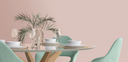
003 Pink Cloud
003 Pink Cloud was inspired by the old saying, “Red sky at night, Shepherd's delight. Red sky in the morning, Shepherd's warning”, and is a sophisticated shade of pink with subtle undertones of grey. As a very versatile and light colour, Pink Cloud can be easily used in most spaces to create a very soothing and familiar feel.
Where to use it?
It can give off a touch of femininity in a space such as a dressing room or nursery, or can be toughened up with contrasting red or blue accessories, for example in a kitchen or living space. As a backdrop to bold soft furnishings and furniture, it can work beautifully as a calming neutral to blend into the background, but equally be at the forefront of a scheme due to its brilliant versatility.
Complementing paint colours
001 Cotton
008 Turton
002 Magnolia
Complementing wall coverings
Ava Marika Blush/Rouge
Doris Plaster Pink
Faded Glamour Pretty Pink
Top tip
For a visually stunning room scheme, pair 003 Pink Cloud with a complementing wallpaper such as Rivington Lush Green. With green and pink on the opposite sides of the colour wheel, it means they work perfectly in harmony together to create a striking look.

004 First Light
004 First Light is a rich and warming shade of pink, inspired by the early dawn Autumn sky. As the more masculine cousin to Pink Cloud, it’s a muted shade with a darker powdery richness to it.
Where to use it?
It works beautifully with complementary tones such as 001 Cotton for a more neutral feel, which would well in a living room for example. For a bolder look, pair with 012 Reservoir, for example in a dining space or bedroom. Due to its depth and versatility, 004 First Light works exquisitely in most spaces for a balanced and sophisticated scheme. It can look darker in rooms where there's less natural light, so something to bear in mind when planning your scheme.
Complementing paint colours
001 Cotton
012 Reservoir
002 Magnolia
Complementing wall coverings
Avar Pink Cloud
Broadhead Forest Russett
Mirk Peat Brown
Top tip
For a visually dramatic room, paint the skirting boards, architraves and doors in 004 First Light, as well as the walls. This technique gives off a seamless and soft effect and also suits most styles; from traditional and cosy to sleek and Scandi.
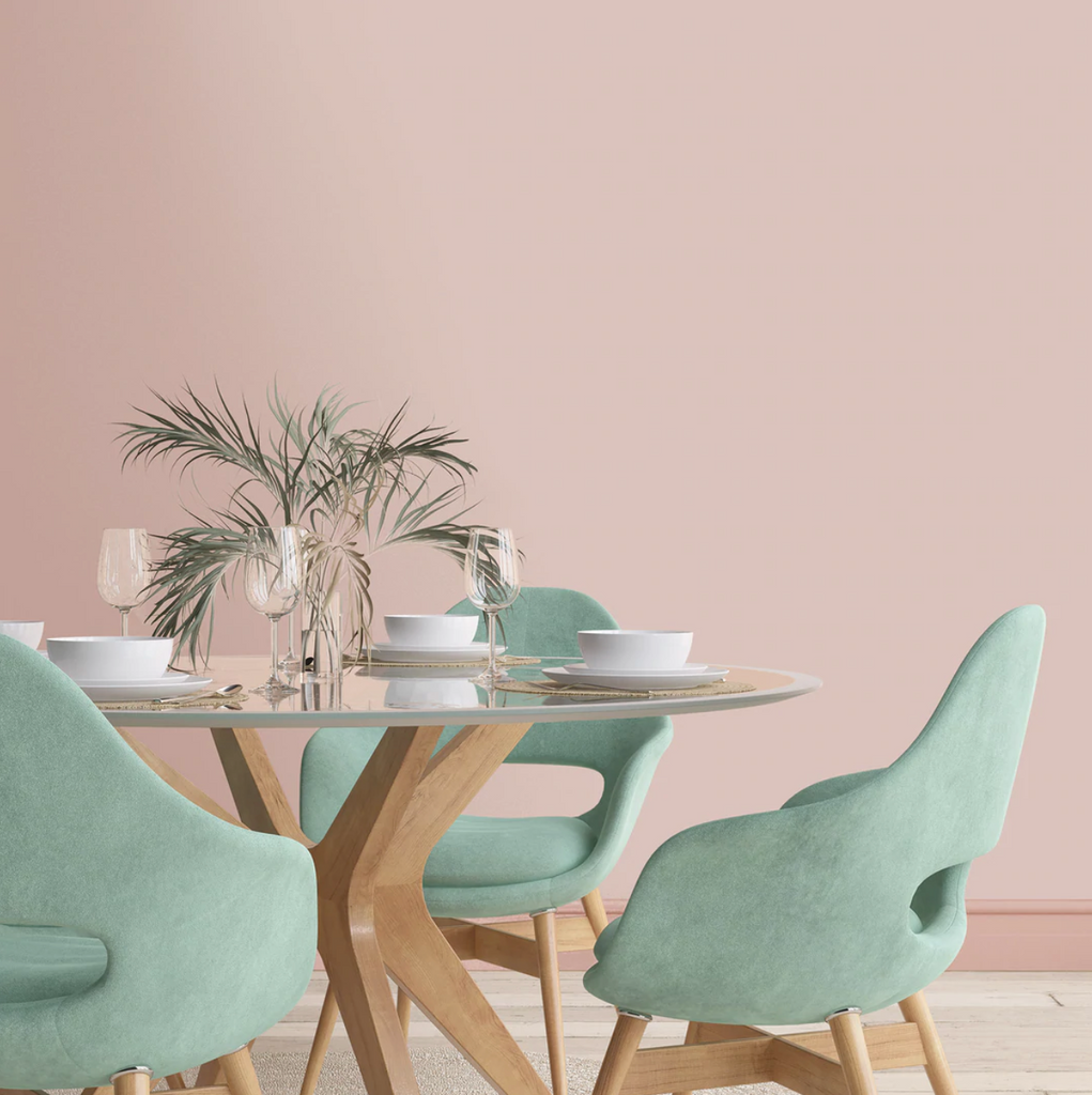
005 Hare
Brown is one of natures neutrals which is why it works with so many colours. Brown Hare is more bold than taupe because of its earthy depth and richness. It brings out feminine colours and pairs perfectly with pink tones.
Where to use it?
005 Hare is a very calming shade and we love it in a bedroom. It works equally as well however in any space where you're looking for a calming neutral; kitchen, living room, bathroom. As a very versatile shade it can also work in any property type; from a modern home to a period property, and suits both traditional and minimalist decor styles.
Complementing paint colours
003 Pink Cloud
001 Cotton
002 Magnolia
Complementing wall coverings
Avar Bracken Green
Swingers Paradise Natural
Top tip
To create a more traditional feel, pair Hare with an art deco inspired wallpaper design such as Mirk, or for a more modern and minimalist look, keep to a neutral scheme of Hare and Cotton paint colours, then add texture and interest with soft furnishings and black accents throughout your accessories.
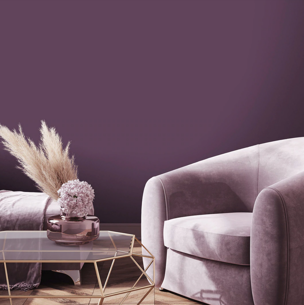
014 Moorland
014 Moorland is a rich, earthy plum colour, inspired by Heather; a special kind of plant which thrives in moorland Lancashire where the weather is often cold and wet.
Where to use it?
Moorland is for the bold, and due to its rich and earthy nature, works best in spaces that are naturally more cocooning, such as a cinema room, dining room or bedroom.
Complementing paint colours
001 Cotton
002 Magnolia
015 Gorse
Complementing wall coverings
Rhododendron Purple & Black
Ava Marika Electric
Fearless Damask Ochre
Top tip
Consider painting up to the picture rail only, or create an imaginary line to give the allusion of one, then paint above the rail and ceiling in a paler colour. Doing this makes the room feel bigger and more open, unless of course you are hoping to achieve a more cosy and cocooning feel, then consider painting the ceiling in Moorland too!

015 Gorse
015 Gorse was inspired by the windy, open moors covered in bright yellow, spiky gorse bushes and dried bright orange Autumnal leaves. It's a rich, organic mustard yellow shade with a rich pigment and lending itself to bold and confident room schemes.
Where to use it?
Wherever you want to be bold is where our Gorse belongs. Consider it in a bedroom for a striking look, a playroom to inject fun and personality, or even a whisky room for a sense of opulence.
Complementing paint colours
014 Moorland
001 Cotton
002 Magnolia
Complementing wall covering
s
Pheasant
Tropic Teal Spice
Lepidoptera Charcoal
Top tip
Try using Gorse on an accent wall if you don't want to commit to the full room